Typography is the science of fitting text within a specific physical or digital context.
The goal of Golden Ratio Typography is to fit text—a font and its associated typographic scale—within a given content width by using the golden ratio.
This process occurs in 3 parts, and the results form a sufficient foundation for an entire design’s worth of sizing, spacing, and typography. GRT lets us determine:
- a typographic scale based on the primary font size
- corresponding line heights for the typographic scale
- spacing units based on the line height associated with the primary font size
We’ll take a closer look at each step in the process below, but first, let’s define the golden ratio, φ:
The golden ratio has many unique properties, and GRT uses one in particular to simplify calculations:
Now that we’ve got the preliminary stuff out of the way, let’s get golden!
Determine a Typographic Scale
The first bit of information necessary to begin the GRT process is a font size, f. For any f, we can apply the golden ratio to determine a typographic scale consisting of 6 usable font sizes:
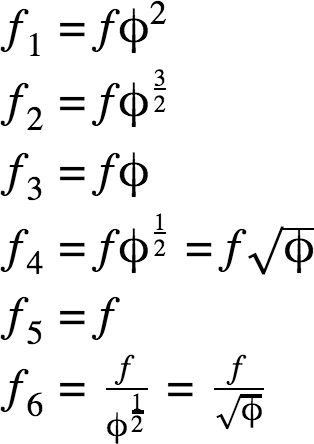
A note about scales: The golden ratio can be applied infinitely in both directions, but nearly all resulting sizes are either too small or too large for practical use.
Real-world application of a typographic scale suggests the 6 sizes included in the GRT Calculator are most useful for websites, books, etc.
Calculate Line Heights for the Typographic Scale
Line height calculations are the essence of GRT. For any font size f, a line height h can be expressed as:
In the equation above, q represents a line height ratio. By extension, a “golden” line height, hφ, occurs when q = φ:
Well that’s easy! Now we can just go through the typographic scale and apply this simple formula to each size, and we’ll have our corresponding line heights…right?
Not so fast.
Experience and research tell us that as lines of text get longer, line heights must also increase in order to maintain proportionality and, by extension, readability.
How does proportionality affect readability? It’s all about the ease with which people can perform the two major actions associated with reading:
- Scanning: Using spatial relationships to understand document flow
- Return sweep: The movement of the eyes from the end of one line of text to the beginning of another
In a 2004 study from the University of Reading, Mary C. Dyson states:
Long line lengths are said to need more interlinear spacing to ensure that the eyes locate the next line down accurately when executing a return sweep…
You’ve almost certainly experienced this readability problem yourself with newspapers or magazines, which often use very tight interlinear spacing (line heights) within narrow columns of text.
The implication here is that line heights must be tuned to fit the context in which they are presented; in other words, line heights must be tuned for the content width.
This tuning process also maintains proportionality across all sizes in the typographic scale, which helps readers scan documents quickly and effectively.
How to Tune Line Heights Based on Content Width
At this point, here’s what we know:
- We can apply the golden ratio to any font size to get a “golden” line height, but…
- This line height must be tuned to “fit” a particular content width.
So the situation is clear—we need a tuning equation to determine the precise line height for a given setting.
And that brings us to what we don’t know: How line heights and content widths are related.
Although we don’t yet know the precise nature of the relationship between line heights and content width, we do have enough information to start formulating a line-height tuning equation.
Assumption 1: The optimal line height ratio (line height ÷ font size) is equal to the golden ratio.
This is the foundational hypothesis of GRT, and it informs all downstream calculations.
Thanks to Assumption 1, we can determine an optimal line height for any font size f. However, in order to establish a working tuning equation, we still need to define both a reference point and also either a lower or upper boundary.
Reference Point for the GRT Line Height Tuning Equation
A reference point is simply a known set of system properties at a specific point. At this juncture, we can make basic assumptions that give us two reference points:
Assumption 2a: The minimum acceptable line height, hlower, occurs when the content width is 0.
Assumption 2b: The optimal line height, hφ, occurs at some content width, wφ, and this width must be greater than 0.
Assumption 2a implies the presence of a lower boundary for the system, which we’ll explore below.
Boundary for the GRT Line Height Tuning Equation
For GRT tuning purposes, we must establish a lower boundary for the line height ratio (qlower) for two reasons:
- Line height ratios less than 1 will result in overlapping text.
- A line of text could be infinitely long, and since line heights must scale up as line widths increase, the upper boundary is infinity. That won’t help us tune anything.
With this in mind, let’s examine 1 as a potential lower boundary for our tuning equation…
Text formatted with a line height ratio of 1 technically has zero interlinear spacing (line height = font size). In this situation, the bottom of one line of text touches the top of the following line.
Even newspapers, which make money by the square inch, don’t dare venture into this territory because it would make their product nearly impossible to read.
Clearly, we need a line height ratio greater than 1 to serve as our lower boundary. And because of Assumption 2, we also know the lower boundary must be less than the golden ratio. This leads us to a new assumption:
Assumption 3: The minimum viable line height ratio, qlower, which applies when the line width (content width) is equal to 0, is some value between 1 and the golden ratio.
But now we have a serious issue—any lower boundary value we choose is going to be arbitrary!
Or is it? Thanks to Assumption 3, we know the lower boundary for the line height ratio lies somewhere between 1 and φ.

Using the golden ratio, we can divide this distance, φ – 1, into “golden sections” da and db. This will lead us to a lower boundary that is not arbitrary, but rather informed by the golden ratio.
We now have everything we need to form a basic line height tuning equation, which is simply our original line height equation with a tuning formula substituted for the line height ratio, q.
Now let’s do a quick sanity check with our reference points from Assumption 2. When w = 0…
And how about when w = wφ?
So far, so good! At this point, it looks like our line height tuning equation is ready for action, but unfortunately, we can’t use it yet because we still don’t know the value of wφ.
In fact, we really don’t know anything about the relationship between font sizes, line heights, and content widths.
In other words, we don’t know how the vertical and horizontal dimensions of text are related.
How are font size and content width related?
When it comes to fonts, all the characteristics we typically work with—sizes, line heights, and x-heights—occur in the vertical dimension. We simply don’t have any information about how fonts behave in the horizontal dimension.
Or do we?
An important typographical concept known as characters per line (CPL) can help shed some light on font behavior in the horizontal dimension.
In fact, we can use CPL to determine an average character width, wc, for a given sample of text. Here’s how this works:
- Start with a one-line text sample with a known CPL,
- Determine the precise width of this line of text, and then…
- Divide the width by the CPL to determine the average character width for this particular font/size combination.
To illustrate, consider this 55-character sample of 18px Merriweather (a Google Font):

Intuitively, the average character width increases as the font size increases. Because of this, the above result—a single data point—isn’t particularly instructive…
But what if we divide the font size by the average character width? Now this is where things get interesting. We’ll call this new value μ:
The equation above is useful because it describes the relationship between font size and average character width—the vertical and horizontal dimensions of text!
With this in mind, let’s calculate μ for our text sample above:
For this 55-character sample of 18px Merriweather, the value of μ is roughly 2.04. This result means that, on average, 2.04 characters will fit in every 18px increment of width. Intriguing!
But what happens if we apply this same analysis to different text samples at different font sizes?
This is where we discover something truly remarkable. For any font, the value of μ remains constant, even at different font sizes! In other words…
Each font can be described by a character constant, μ, that relates the font size to the average width of each character.
The character constant is incredibly valuable because it describes the mathematical relationship between the vertical and horizontal dimensions of text.
It’s not just some random number, either; on the contrary, the character constant provides immediate insight into the physical nature of any font:
- Lower character constant values indicate “fatter” fonts, and
- higher values indicate “skinnier” fonts.
You oughta know: In practice, character constants typically run somewhere between 1.6 and 3.25, with a mean value of roughly 2.25.
At this time, no major font foundries publish information on the character constant values of their fonts (though it would be totally cool if they did!). Because of this, I run all fonts in the GRT Calculator through a little app I built to determine the character constant.
For academic purposes: The actual character constant—“mu value”—for Merriweather is 2.03, which you converge on after averaging character constants over a wide array of text samples.
Constant Width Factor Tuning
Although the character constant tells us how height and width are related for a particular font, we still don’t know the value of wφ for our tuning equation.
In other words, we still need to determine the content width at which a “golden” line height is a “perfect” fit (this is the definition of wφ).
Thanks to the character constant, we can use mathematic substitution to describe the content width in a new way:
In the new width equation above, we can isolate the CPL ÷ μ portion because it’s the only aspect that is dynamic from font to font. We’ll call this the width factor, xw, as it is the multiplier that ultimately determines the content width.
Now let’s consider the current objective—to determine a value for wφ—through the lens of the width factor equation. We’ll start with what we know:
For any font, μ is constant. Because of this, we can manipulate the width factor simply by changing the CPL value.
To illustrate this, let’s see how this system behaves for a μ value of 2.27, which is the mean character constant based on physical data from 135+ fonts:
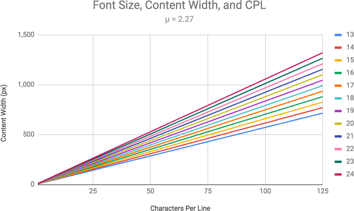
In the chart above, the width factor is the distance between the lines at any given CPL. Because μ is constant, the width factor increases linearly as CPL increases.
At 75 CPL, the width factor for a font with a character constant of 2.27 is essentially 33. And since this is a linear system, if we change the character constant, the CPL at which the width factor equals 33 is going to change as well.
For example, for a μ value of 1.67, a width factor of 33 occurs at 55 CPL. And for a μ value of 2.75, a width factor of 33 occurs at 91 CPL.
Despite having totally different character constants, these 3 scenarios are proportionally similar and will result in identical line lengths (content widths):
- μ = 2.27, CPL = 75
- μ = 1.67, CPL = 55
- μ = 2.75, CPL = 91
In other words…
We can maintain proportionality among font size, line height, and content width—even with different fonts—by holding the width factor constant.
At this point, even though we don’t know the value of wφ, we can use substitution and knowledge of the constant width factor to generate a useful tuning equation:
The equation above reveals the following truths about constant width factor tuning, which:
- Makes the basic line height calculations the same for any font at a given content width
- Eliminates content width differences between different fonts (but not CPL, which will indeed be different!)
- Is ultimately arbitrary
That last point is crucial because it suggests there is no width factor that yields a “golden” value for wφ.
Instead of being a “golden” indicator, the width factor is actually a tuning fulcrum point that allows us to choose the content width at which the line height equals the golden ratio (for a given font size).
While this tuning point is ultimately arbitrary, we do have information that can help us nail down an appropriate value for the width factor.
How do we choose a constant width factor for tuning?
We don’t have much direction when it comes to choosing a constant width factor to inform the fulcrum point in our line height tuning equation.
But we do know a little bit about the conditions under which people can read voluntarily, quickly, and easily. Based on this information, we can identify a sensible range of potential values for the width factor.
Condition 1: People find shorter line lengths more “inviting” to read.
In a 2001 study, Mary C. Dyson of the University of Reading found that participants were more likely to start reading passages set at 55 CPL (the shortest line length in the study).
In other words, longer line lengths were seen as requiring more effort to read, and thus participants were less likely to read passages presented in this format.
Another similar study included a 35 CPL line length, and participants preferred this length for “elective” reading.
Condition 2: People read more slowly as line lengths get shorter.
But there’s no free lunch in life, and there’s no free lunch here—reading speed drops as line lengths get shorter.
Clearly, you don’t want line lengths to be too long, or else no one will read your content. By contrast, shorter line lengths impair reading speed and increase the likelihood of return sweep mistakes, so you don’t want to go too short, either.
The bottom line here is that we want to tune line heights around a reasonable content width.
In other words, the constant width factor we select for tuning should yield content width values on par with what we actually see on most screens: 350px (small mobile screens) up to 1000px or more (desktop screens).
To give you an idea of the range of width factors we might consider, here are some CPL and width factor combinations for an “average” font with a μ of 2.27 (associated content width @ 18px font size shown in parentheses):
- CPL = 35, xw = 15.42 (278px)
- CPL = 45, xw = 19.82 (357px)
- CPL = 55, xw = 24.23 (436px)
- CPL = 65, xw = 28.63 (515px)
- CPL = 75, xw = 33.04 (595px)
- CPL = 85, xw = 37.44 (674px)
- CPL = 95, xw = 41.85 (753px)
- CPL = 105, xw = 46.26 (833px)
- CPL = 115, xw = 50.66 (912px)
Considering real-world screen sizes, font sizes, and content widths, you could make an argument in favor of a constant width factor between 15 and 51.
However, it’s often sensible to ignore extremes when seeking a “Goldilocks zone”, and golden ratio typography is no exception.
35 CPL results in an awkwardly narrow column of text on any screen larger than that of a handheld mobile device, so we’ll take it out. 45 CPL is only a little better; for the sake of this analysis, we’ll throw it out, too.
We know people’s interest in reading text declines as lines of text get longer, so we can also throw out the 105 CPL and 115 CPL possibilities as being too long to serve as the basis for line height tuning.
Pro tip: Speaking in terms of width factors is far more accurate than CPL, which differs depending on the physical characteristics of the font in use.
This leaves us with a potential range of constant width factors between 24 and 42. If we tune line heights by using width factors within this range, we should get a result that is “just right” for typical columns of text.
But is there anything special about the numbers in this range? Can we use the golden ratio to gain insight about which constant width factor value we should use in our tuning equation?
Although there is nothing special about the “Goldilocks” range of constant width factors, it is worth noting that one value—34—is a Fibonacci number that does have some “golden” influence.
Through extensive testing, I’ve found constant width factors in the 33-35 range to yield pleasant results that work well in both desktop and mobile environments (and also in books!).
Because 34 sits right in the middle of this range, I have chosen it as the constant width factor for line height tuning in the GRT Calculator.
Interestingly: The Fibonacci numbers adjacent to 34—21 and 55—lie just outside the range of constant width factors appropriate for line height tuning.
Line Height Corrections for Different Fonts
One of the coolest aspects of the constant width factor is that it removes the need to consider individual font characteristics when calculating the base line height for a given geometry (font size and content width).
But everybody knows fonts can be massively different from one another. In many cases, base line heights may seem imprecise due to the characteristics of the font being used. Specifically…
The font x-height determines whether or not a correction is needed to adjust the base line height for a perfect fit.
The font x-height is the height of a lowercase letter (typically an ‘x’), and it can be expressed as a ratio of the x-height to the cap height (height of a capital letter, typically a ‘T’).
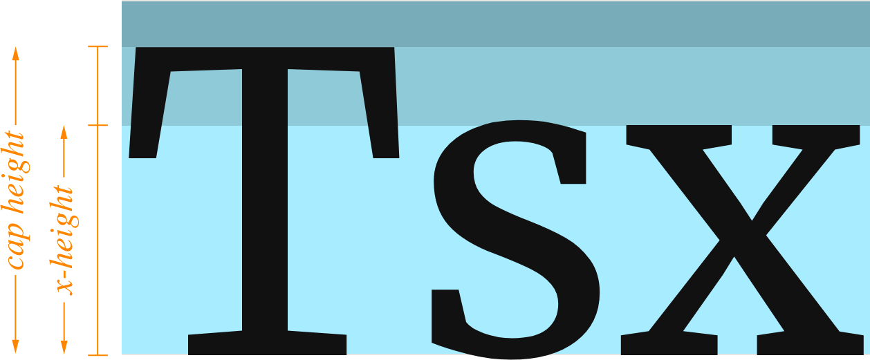
With this in mind, we can add an x-height correction, cf, to our line height tuning equation:
In the same way we tuned our base line height according to the content width, we must also tune the line height correction according to the x-height, x, of the current font:
We know that a perfectly “golden” font—where the x-height is a golden section of the cap height—will not require any correction. The associated x-height ratio for this tuning fulcrum, x0, is equal to φ – 1. This gives us a complete x-height tuning equation:
Ultimately, correcting for different font x-heights is a simple process, but there’s an obvious problem—we don’t know precise x-height data for any fonts!
Fortunately, it’s possible to determine x-height ratios by using a browser and some CSS. I’ve used this approach to compile x-height ratio data for over 135 fonts (118+ Google Fonts and a handful of system fonts), and the GRT Calculator uses this information to adjust line heights based on the selected font.
For the sake of clarity: Fonts with x-height ratios greater than 1 ÷ φ will have corrected line heights that are greater than the base line height.
Fonts with x-height ratios less than 1 ÷ φ will have corrected line heights that are less than the base line height.
Calculating Line Heights for the Typographic Scale
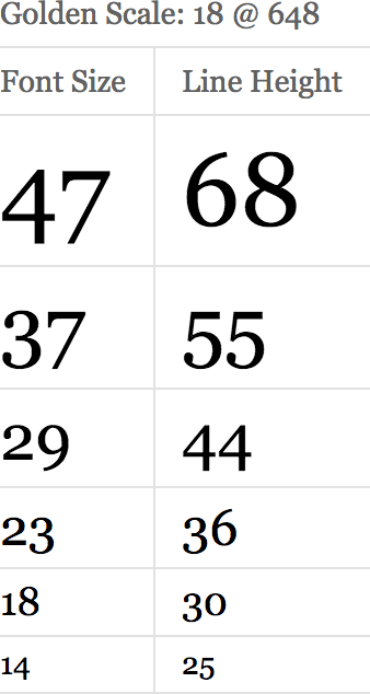
This is a trivial process, but it’s necessary to determine the complete font size + line height scale to complement the typographic scale we calculated earlier.
To generate these values, we simply need to run the font sizes from our typographic scale through the complete line height equation (with x-height correction).
This yields a simple table like the one you’ll find on the GRT Calculator:
Determine Spacing Units from Primary Line Height
While line height tuning is the essence of Golden Ratio Typography, related “golden” spacing units may be the most useful result from a design perspective.
Having a standard set of spacing units—especially if they are proportionally related—is incredibly important because it removes arbitrary selection from the design process.
By employing the spacing units outlined below, you can ensure your designs are always proportionally related by the golden ratio:
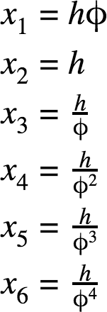
These spacing units are based on the line height of the primary text, which is the most important spatial element on the page.
GRT: 18 Data Points, Infinite Potential
The Golden Ratio Typography process results in 18 data points that are sufficient to inform an entire design’s worth of typography and spacing:
- 6 typographic scale values
- 6 associated line heights
- 6 spacing unit values
The implications are huge—GRT enables 100% programmatic layouts that can scale to fit any environment.
Wherever GRT is implemented properly, you will be able to test different font, size, and width combinations easily, and every combination you test will be perfectly tuned to the viewing environment.
This isn’t just a design breakthrough—it’s how design is done.